WorkFood & drink · Shopify
The Naked Marshmallow Co: every flavour gets its own storefront
A British gourmet marshmallow maker needed a Shopify store as distinctive as its packaging. We built per-product colour schemes, metafield-driven ingredient and allergen rendering, and a block architecture that runs every seasonal campaign.
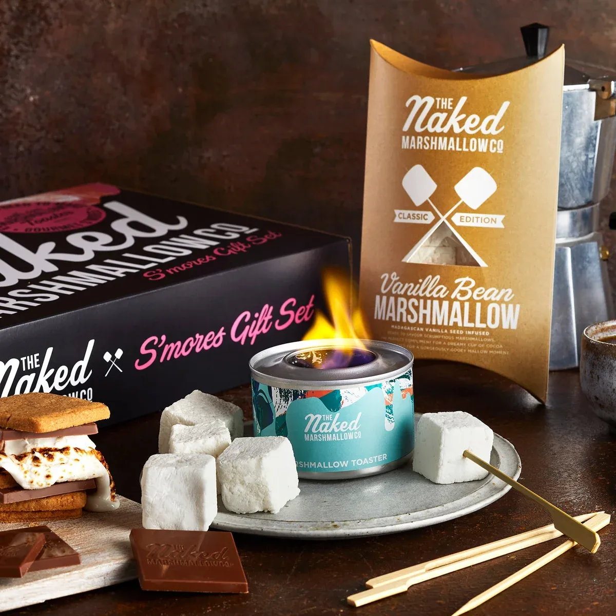
- 1:1colour scheme per producteach page takes its palette from the pack it sells
- Structuredingredients & allergensrendered from metafields, allergens emphasised
- Blocksfor every seasonal campaignlaunches assembled in the editor, not in code
The challenge
The Naked Marshmallow Co makes gourmet marshmallows in the UK from British ingredients, with no nasties. The packaging does a lot of the selling: every flavour has its own colourway, from the sky-blue Salted Caramel to the gold-on-plum Festive Edition. Customers recognise a flavour by its colour before they read its name.
The store needed to carry that through. A single site-wide palette would flatten a range designed to look different. Food products also bring obligations a typical theme handles badly: full ingredient lists, with allergens clearly emphasised, that have to be right on every product. And the calendar is seasonal. Christmas, gifting and limited editions each need their own campaign, launched by the team rather than queued behind a developer.
What we did
Bespoke colour schemes on every product page. Each product carries its own scheme, and the page follows it. The announcement bar, header, background and type all shift to match the pack. Salted Caramel sells on blue; Sugar Plum sells on deep plum and gold. Adding a new flavour means choosing its colours in the admin, not writing CSS.
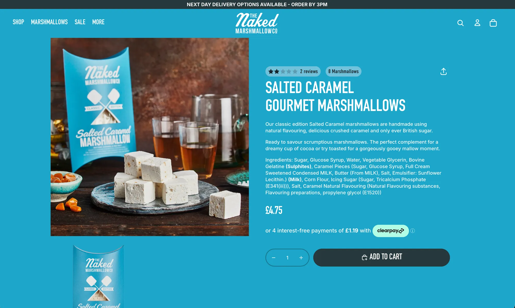
Ingredients and allergens rendered from metafields. Ingredient lists are stored as structured product data, not pasted into descriptions. The theme renders them consistently on every product page, with nested ingredients and allergens emphasised the way a pack label does: bold Sulphites, bold MILK. Product facts like pack size come from the same data and appear as pills beside the reviews. Because the data is structured, a recipe change is one field updated in one place, and the page can’t drift out of step with the pack.
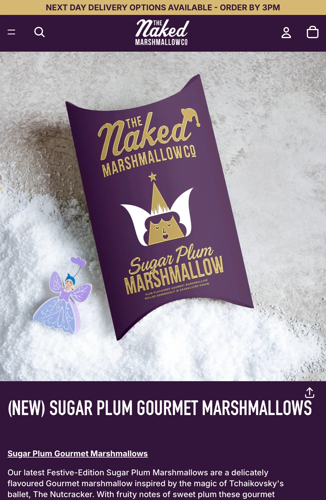
A merchandising block architecture for seasonal marketing. The homepage and landing pages are built from a library of sections and blocks: hero banners, value props, best-seller carousels, gift-set features and editorial content. Each one is configurable in the theme editor. Seasonal campaigns are assembled and swapped by the team. The Christmas range, a new limited edition or a gifting push is a page build in the editor, not a development ticket.
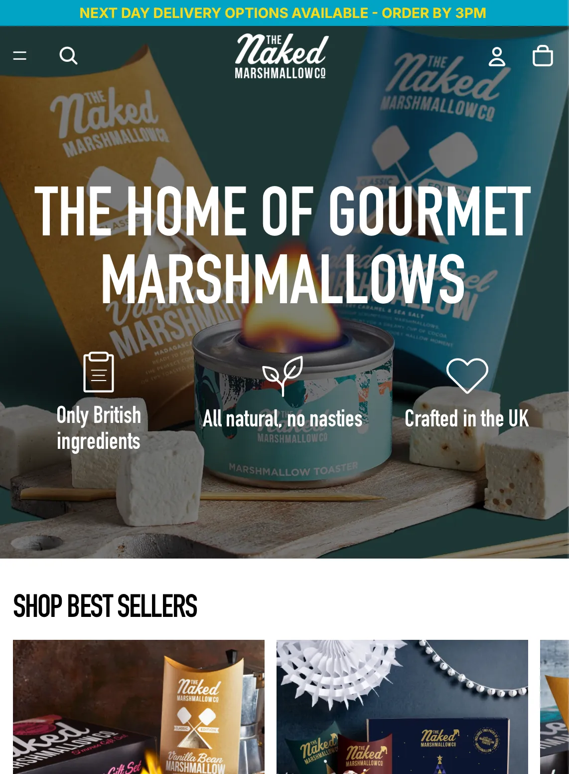
The packaging was already doing the selling. The store’s job was to keep every flavour looking like itself, all the way to the cart.
What it changed
The storefront now looks like the range. Each flavour arrives on a page in its own colours, so the recognition the packaging builds on the shelf carries straight through online.
Ingredients and allergens render from one source of truth, consistently, on every product, and a reformulation updates in one place.
The seasonal calendar belongs to the team. Campaigns are built from blocks in the theme editor, so launches land when the marketing plan says they should.